

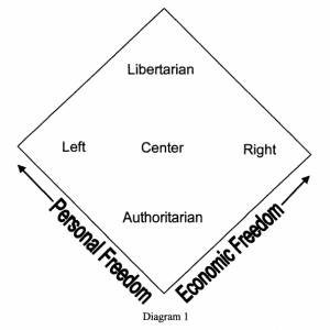
Most readers of Liberty are familiar with the Nolan chart. Created by Libertarian Party founder David Nolan, it tries to illustrate, clearly and graphically, the reasons why libertarianism has no place on the simplistic, one-dimensional left-right political spectrum.
Nolan separated freedoms into two types: personal and economic. He claimed that the Left favored personal freedoms over economic freedoms and the Right favored economic freedoms over personal ones. He made a two-dimensional chart with each type of freedom on an orthogonal axis, as shown in diagram 1 (on the next page).
For decades, this chart has been used at county fairs and college campuses to educate the public. Typically, libertarians manning a Nolan chart booth ask each visitor a set of ten questions; five about personal freedoms and five about economic freedoms. The visitors are then shown where their opinions put them on the chart. A large percentage of people discover that they belong in the libertarian quadrant. The chart has had great value in explaining libertarianism and recruiting converts.
But the chart has some problems. First, it is an overgeneralization to say that the Left supports more personal freedoms than the Right. The best example is the right to bear arms. This personal freedom is favored much more strongly by the Right than by the Left.
Another problem is the way the chart deals with authoritarian political systems. When communism and Nazism are plotted on the chart, they end up in essentially the same location, near the comer indicating the absence of both types of freedom. But these two philosophies are quite different in many ways, and in the real world, advocates of the two systems rarely cooperate politically. An accurate political map should not show them co-located.
A third problem with the chart is that the center is not well defined. Two centrist visitors to a Nolan chart booth could answer every question differently from each other, yet end up together in the middle of the chart.
But the fundamental problem with the Nolan chart is that it is a mistake to categorize freedoms. Freedom is freedom. Categorizing freedoms lends legitimacy to the Left-vs.-Right political battle that garners so much of the public’s attention. It diverts notice from what many freedom-loving people consider the real battle: the struggle for the individual’s freedom from the state.
These difficulties with the Nolan chart provide motivation for searching for a better chart.
Pournelle Chart
Another attempt at a two-dimensional political map was made by science fiction writer Jerry Pournelle in his doctoral dissertation in political science (diagram 2). The axes of Pournelle’s chart measure how much power a person believes the state should have, versus how much power the person believes that the application of reason can have in solving society’s problems.
With respect to categorizing freedoms, the Pournelle chart is an improvement on the Nolan chart. Pournelle’s has only one axis of freedom, and it includes all freedoms.
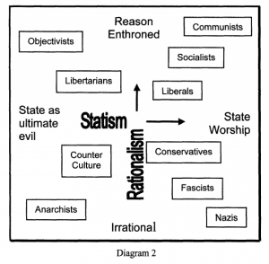
But the Pournelle chart also has problems. One is that it separates “libertarians” from”objectivists,” although most of today’s libertarians dislike the state as much as objectivists do. And if the chart is to be used to show how close one philosophy is to another, libertarians in general would like to be at least as far away from liberals as they are from conservatives.
The chart also shows a wide separation between libertarians and anarchists. One definition of a libertarian society might be “as close to anarchy as possible without social breakdown.” But according to the chart it is not possible to be on the border between “libertarian” and”anarchist.”
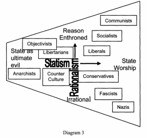
Pournelle’s chart would be a little more accurate as a political map if the left side were much smaller than the right, as shown in diagram 3. The purpose of the chart is to show how various groups view the role of the state. Groups on the left side of the chart see a much smaller role for the state than those on the right side. So as you move toward the left, it becomes less relevant whether you believe in rationalism or not; the role of the state is diminished in either case. Therefore the Rationalism axis should be smaller for non-statists. If a modified Pournelle chart were to include pure anarchists, the left side should diminish to a point, resulting in a triangular chart.
A further difficulty with the chart is that in common language the word irrational is almost always used in the pejorative sense. That was not Pournelle’s intention, and in fact, Pournelle describes his own philosophy as irrational, meaning that he tends toward using time-honored traditional, as opposed to rationalistic, methods to solve society’s problems. But the dictionary definition of rationalism is not understood by the average person. Describing conservatives as irrational will do more to anger than to educate people. It is counterproductive to make college-level philosophy courses a prerequisite for understanding a chart like this.
The Pournelle chart is less suitable than the Nolan chart as a tool for educating the public about the meaning of libertarianism. Yet the idea of using a triangular political map is useful.
Rummel Chart
It happens that the idea of a triangular chart is not a new one. Professor R.J. Rummel of the University of Hawaii presented such a chart in his book “Understanding Conflict and War” (vol. 2, Sage Publications, 1976). The chart looks something like diagram 4.
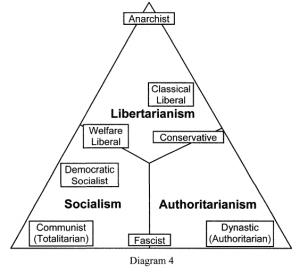
This chart shows libertarianism as one of the world’s three main competing political philosophies. For the purpose of advancing liberty, this is a more desirable depiction of the political landscape – though like the other charts, Rummel’s is not much use in educating the general population.
One problem is Rummel’s distinction between totalitarianism and authoritarianism. His chart separates these two as widely as possible. Yet the general public views these two words as virtually synonymous. A booth at a fair is not a convenient place to attempt to explain the difference; indeed, many well-educated people may not even agree with Rummel’s idea on this point. In general, individuals are hard to place on the Rummel chart. It would be difficult to invent a series of questions that would allow the questioner to plot a respondent.
A New Chart
To be a useful tool in plotting individuals, a political chart should have labeled orthogonal (or at least nearly-orthogonal) axes, and it should have a triangular shape. For simplicity’s sake the chart should show the Left on the left and the Right on the right. Libertarianism should be placed at the highest point in the chart, to create a favorable impression.
The next step in designing the chart is to choose the definitions for the two axes.
The vertical axis is easy to assign. What separates libertarians from both the Left and the Right is their belief in individual autonomy over the state, so the vertical axis should measure that.
Assigning a label to the horizontal axis is more challenging. A determination must be made as to what differentiates Left from Right. As discussed earlier, this is not just a matter of specifying a preference for personal or economic liberties. And Rummel’s distinction of totalitarianism vs. authoritarianism is too cloudy. Pournelle comes closer with his claim of rationalism over irrationalism, but it still slightly misses the mark. To determine a difference, a table of contrasting viewpoints can be compiled and an analysis made. The following table compares the general attitudes of people on the Left with those of people on the Right:
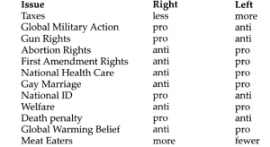
This is by no means a comprehensive list. It is mostly a list of some of the issues in the news at the time of this writing. Its intended purpose is to facilitate the discovery of a pattern of traits that distinguish Right from Left.
The first (disturbing) characteristic that becomes apparent from looking at the list of the things the Right favors is that most of them are in some way or another overtly associated with violence. However, some things favored by the Left are also violent, though in a subtler way. Both Right and Left are equally anxious to use the power of the state to promote their ideologies, so both advocate the use of force against peaceful citizens – violent force if resistance is encountered. So it is a mistake to label the Right as more violent than the Left.
A better distinction is that the Right believes in more traditional values while the Left prefers what might be termed modern values. This is similar to Pournelle’s axis of rationalism but is more easily understood and is less likely to offend. Applying these labels, the chart now becomes the one shown in diagram 5.
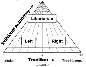
More clearly than the other charts presented here, this one shows the essence of the political landscape. Simplicity is its most important trait. At a glance the general idea of libertarianism is presented.
The chart could be made more complicated by adding labels for some major political factions in approximately the same places they occupy on Rummel’s chart. If they are added, these labels should be kept smaller than the three main labels, and the fascists should be moved to the right. An example is shown in diagram 6.

Should this chart be used as the Nolan chart is today, a set of questions could easily be developed to help respondents find their places on it. As with the Nolan chart, two sets of questions should be asked. The first set would attempt to determine a person’s position on the horizontal scale. The second set would determine his or her attitude toward self-government. But unlike the questions annexed to the Nolan chart, the questions for this chart could use the same topics for both axes.
For instance, one topic could be Discipline. The question for the horizontal axis might be, “Choose the sentence that best describes your beliefs:”
1. Criminals are mostly victims of society and need rehabilitation. The death penalty is wrong.
2. Our current criminal justice system is mostly fair. I’m undecided on the death penalty, and I like the appeals process.
3. Strong punishment is the best solution for handling criminals. The death penalty should be consistently applied where appropriate.
The questions for the vertical axis should also contain one set of statements on the topic of Discipline, such as the following:
1. More police are needed to enforce the laws. We need longer prison terms.
2. Our current level of police and imprisonment seems about right.
3. There are way too many laws and way too many people in prison. Using the same topic for both axes solidifies the idea that the state does not have to be involved in all areas in which people disagree.
Advantages
The biggest advantage that this new chart has over the Nolan chart is that it does not give people the mistaken idea that freedoms are classifiable. After visiting a Nolan chart booth, many people walk away with the idea that Republicans and Democrats are champions of one or another type of freedom. The new chart shows that both parties in their current form are enemies of individual freedom.
Many people think that libertarians are a wing of the Republicans. Nolan’s chart gives credence to that notion by showing libertarians in agreement with Republicans on economic issues. The chart presented here does not result in that impression.
The new chart, and its associated questions, can also deal better with the issue of gun rights than Nolan’s does. This is a personal freedom that is generally supported by the Right, not the Left, even though the relationship should be opposite, according to Nolan’s concept. When viewed as a traditional value, as the new chart would enable people to view it, the right to own a gun is properly placed in the realm of the Right.
Like the Nolan chart, the new one has an ill-defined middle, but this is less of a drawback for the new chart. When the axis of individual autonomy is emphasized, as in the
Time explaining rationalism or the subtleties of totalitarianism versus authoritarianism is time not spent explaining libertarianism.
new chart, it is not so much of a problem for people to be colocated. The chart makes the vital point that Right and Left can coexist more peacefully the further up the vertical axis they move. In contrast, the vertical axis is missing, or at least very poorly defined, in Nolan’s chart.
The new chart has an advantage over both the Pournelle and Nolan charts in showing the distances between various political ideologies more accurately. Libertarians are shown near the anarchists, and communists and Nazis are widely separated.
Lastly, the new chart avoids labels that are potentially confusing or offensive. A chart needs to make the most use of the brief moment when a responder is interested in the topic. Taking time to explain rationalism or the subtleties of totalitarianism versus authoritarianism is time not spent explaining libertarianism.
The Nolan chart has gone a long way in educating the public. But its shortcomings have prevented a clearer understanding of liberty in general. It teaches that the Left and the Right are both defenders of some type of liberty. The new chart refutes that myth; it shows that both are pro-state and anti-freedom. Whereas the Nolan chart shows libertarianism as just one of many legitimate political ideologies, the new chart redefines the political landscape, identifying libertarians as the only champions of freedom. People who are passionate about promoting liberty – true, unclassified liberty – should consider switching to the chart presented here.